February20
None of the Above
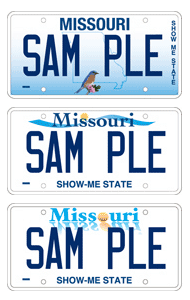 I got an email from a co-worker today that had a link to go vote for Missouri’s new license plate design. I must say that I’m not impressed with ANY of the three choices.
Bluebird
A bluebird? Really? I like the outline of the state, but loathe where the “Show-Me State,” tagline was placed. It appears to have been an afterthought. Like the use of the gradient, but otherwise, not a very strong design.
Ribbon
What exactly is the ribbon for? Is it the Blue Ribbon Coalition? Is it to protect free speech online? Or is it some lame design nugget that looks like water? If it’s supposed to be water, then it needs to be brown, since the Might Mo is a dirty river.
Reflection
When I think of Missouri and the “Show-Me State,” I think of reflections. I often reflect on my own life, my time in Missouri and others. What we need is a license plate to do this. Or not. And what’s up with those colors?
Where’s the option for none of these? They’re so uninspiring. Maybe the goal was to give the other 49 states more reasons to make fun of us. Mission accomplished.
+ original post date: February 20, 2007 11:32 AM
+ categories: Funny, Ha Ha, KC, WTF
comments8
(comments rss feed)
The first one almost wins. I love gradients, however, that one is pretty awful and the placement of "SHOW ME STATE" was definitely a "You mean the client wants to have both the bird AND the slogan?!"
The second one is just dull and although the third one almost looks kinda Web 2.0ish, it's still pretty terrible.
When I heard about the new Arkansas license plates, they sounded terrible but I kinda like em now.
Sorry, dude. You did move to Missouri, though...
+ author: Todd
+ posted: February 20, 2007 11:12 PM
dude, i'm gonna go totally client-side here and vote that we mash the gradiet from numero uno with the third design (actually its not so much of a design as a sad little layout).
that would rule...and by rule i mean suck slighty less than without the gradient
+ author: parc
+ posted: February 21, 2007 09:52 AM
Didn't Missouri just get new plates? I really hate police departments dictating things like this. They want white backgrounds and heavily-contrasted dark text, so the vehicles can be easily tagged.
The problem I see in Missouri is that motorists are allowed to place dark shades over the plates, in an effort to make them more difficult to read. This is illegal in most states. So instead of doing what makes sense(making such obstructions illegal), the state opts for spending gajillions of dollars to accommodate a allowance that doesn't make sense.
+ author: bahua
+ posted: February 21, 2007 03:07 PM
Yeah, the police suck... Or wait, maybe the Department of Revenue... Or maybe the people that buy those dark covers...OR just everyone, including the new plates...
+ author: smanley
+ posted: February 21, 2007 04:35 PM
I prefer the current plates over all of those.
The rumored reason for the new places is because Missouri Republicans need more revenue since they promised to not raise taxes. Creative thinkers!
And yes, this means you MUST purchase the new plates when you get your sticker next year.
+ author: Jeff
+ posted: February 22, 2007 10:17 AM
The first two look like they were designed in Microsoft Word. The bottom one has one of those trendy web 2.0 reflections. It's awful execution and the branding actually fosters a negative reaction.
License plates are the single most visible medium for a state outside of the state. If Missouri wants more tourism, they better rethink this.
I think you and/or SHS should have a Design a Better License Plate Contest. You and others should offer up designs. Open it to the public. Then you all can put out a press release about how Missouri is shooting themselves in the foot with these options. I think we could get the Star to devote a Thursday feature page to it. It would be great publicity and it might even get someone in Jeff City to notice.
Just a thought.
+ author: Sean
+ posted: February 28, 2007 09:02 PM
These are all craptacular. I think Robin read somewhere that the bird won.
Yay. We get to have a Microsoft Word clipart bird stuck to our cars.
+ author: Jeremy Fuksa: Creative Generalist
+ posted: March 22, 2007 12:52 PM
HAHA.... i made a post similar to this on my blog a few weeks ago. It is embarrassing that these designs are the BEST we could come up with. THey all suck and look like they were made with microsoft publisher.
+ author: Ryan McCoy
+ posted: October 2, 2007 02:56 PM
post a comment